_GOTOBOTTOM
General Ship Modeling
Discuss modeling techniques, experiences, and ship modeling in general.
Two well-done submarine dios
velotrain
Visit this Community
Massachusetts, United States
Joined: December 23, 2010
KitMaker: 384 posts
Model Shipwrights: 20 posts
Posted: Sunday, August 04, 2013 - 06:42 AM UTC
(which, unlike a steak, is a good thing)

Here are another couple of finds from the past few days. In a chase to find ever better images of one diorama I like, I keep stumbling across new distractions. I’ll have to stop browsing these photo sites, or I’ll actually fill my hard drive, which had originally seemed most unlikely.
This site has links to photo galleries from dozens of past European shows, and it seems to me that they often approach dioramas with a different sensibility than North Americans. YMMV
http://www.primeportal.net/scale_modeling.htm

The first dio is from the 17th Campinas Plastic Modeling Group Open convention, held at Valinhos, Brazil, almost one year ago.


It was photographed by Rato Marczak (ratomodeling.com) – there’s two other similar images in his gallery pages, as well as thousands of photos from other North and South American shows – not to mention his own excellent work, although he’s clearly most interested in airplanes. While I like it, it also seems somewhat too orderly - sort of like the sailors in formation on the left side.

I would have liked it more if it wasn’t so strictly squared off to the base. I can live with the sub not being supported for the full length, although it’s probably not healthy for the hull - and on a sub, no less. What bothers me more it that there’s nothing to prevent it from rolling over. There’s a single board fore and aft, but you don’t need to look all that carefully to notice that they’re not actually braced against anything. I would have expected something more like this:


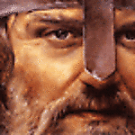
Today I found a scene that appeals to me much more - with a lot of that due to the usage of multiple levels and a high degree of spatial awareness and design, which brings it into the realm of theater and set design. This is from Euro Militaire in 2009, and the photo is by Michael McLaughlin (MilitaryModeling site).


I later found a front-on shot - which tends to lose the depth somehow, as the layers are compressed, with some foreshortening going on. The image is by Heiner Sander, who built the diorama. His figures are interesting characters, but the clothes often seem a bit too smooth, shiny and plastic-y. Some enterprising company should create a paint that dries looking like fabric – or is it the modeler’s responsibility to create that texture on the surface?


A half-dozen detail photos are here: http://tinyurl.com/mlhxfgd
vonHengest
Visit this Community
Texas, United States
Joined: June 29, 2010
KitMaker: 5,854 posts
Model Shipwrights: 350 posts
Posted: Sunday, August 04, 2013 - 05:17 PM UTC
These are great Charles!

The reason the second one loses the visual depth when viewed directly from the front is because all of the major components are aligned parallel to the leading edge. Adjusting the dock structures and sub hull to an angle not parallel to any of the base edges would keep the spacial effect intact regardless of viewing angle. Everything else is balanced incredibly well as you stated.

In regards to the figures, you can absolutely achieve a realistic cloth look when you are painting them. Their is no reason that their clothes, or any other part of them, has to look like shiny plastic. There are plenty of paints that can achieve this effect directly from the bottle, and there are also additives that you can apply to your paint to reduce the glossiness if so desired.
velotrain
Visit this Community
Massachusetts, United States
Joined: December 23, 2010
KitMaker: 384 posts
Model Shipwrights: 20 posts
Posted: Monday, August 05, 2013 - 06:42 PM UTC

Quoted Text

The reason the second one loses the visual depth when viewed directly from the front is because all of the major components are aligned parallel to the leading edge. Adjusting the dock structures and sub hull to an angle not parallel to any of the base edges would keep the spacial effect intact regardless of viewing angle.


Jeremy - If you look at the first photo you can see that there's maybe a 10-15 degree angle to parallel, starting at the sub. If he used any more than that, it would change the whole dynamic, giving him a lot of open water to fill if nothing else. I like the way he has used what water there is to help build up (so to speak ;-) to the submarine, so all that mass isn't at the absolute front of the dio.

Faust had suggested "The front view of that U-boot dio looses depth because the whole dock up to the level of the houses is all in the same color", and I do think that's a lot of it. Also, I noticed that the first photo has an overall brown tint, while on the second it is gray.

However, I think widening one end of the dock and/or the street above might help. The sub is at a bit of an angle, but everything after that is generally parallel - except for the storehouse.
vonHengest
Visit this Community
Texas, United States
Joined: June 29, 2010
KitMaker: 5,854 posts
Model Shipwrights: 350 posts
Posted: Tuesday, August 06, 2013 - 01:41 PM UTC
Ha! I got so lost in looking at the U-Boat and dock that I completely overlooked that, the dock and buildings are also at the same angle. Faust is absolutely correct about "flat" colors, and that second photo is also washed out with lighting so we aren't really seeing the true tone depths and color variation. I played with the lighting and some color adjustment and it looks much better, close to the feel of the first image. The builder probable could have gotten away with up to a 25-30deg angle while retaining proper balance, but I like the current balance of the water to object ratio.
 _GOTOTOP